")
In the age of big data, interpreting complex job market trends can be a daunting task. With vast amounts of information generated daily, the ability to make sense of it all is crucial for employers, job seekers, and policymakers. This is where data visualization comes in. By transforming raw data into visual representations, data visualization helps to uncover patterns, trends, and insights that might otherwise remain hidden. In this article, we will discuss the importance of data visualization in interpreting complex employment trends and provide examples of effective visualizations that convey insightful data.
Source: Medium
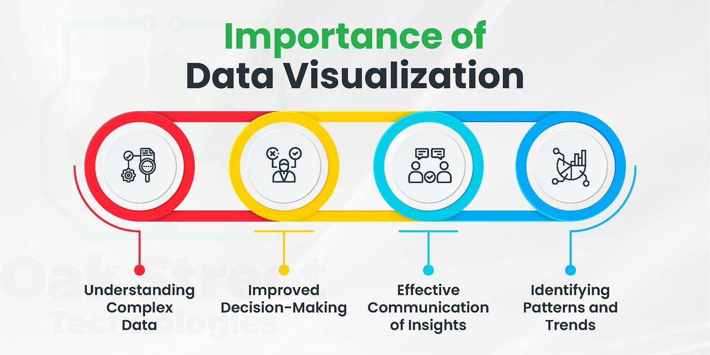
Data Visualization in Labor Analysis
Simplifying Complexity
The labor market is influenced by a myriad of factors including economic conditions, technological advancements, demographic changes, and policy decisions. Data visualization simplifies this complexity by presenting information in a clear and concise manner. It allows stakeholders to quickly grasp the current state of employment, identify emerging job market trends, and make informed decisions.
Enhancing Comprehension
Raw data, especially in large volumes, can be overwhelming. Data visualization converts this data into graphical formats such as charts, graphs, and maps, making it easier to understand. For instance, a line graph can show the trend of unemployment rates over time, while a heat map can highlight geographic variations in job growth.
Facilitating Comparison
Data visualization enables easy comparison between different job datasets. This is particularly useful in labor analysis where comparisons are often needed between industries, regions, or demographic groups. For example, a bar chart can compare the job growth rates of different industries, while a scatter plot can show the relationship between education levels and employment rates.
Revealing Hidden Insights
One of the key benefits of data visualization is its ability to reveal insights that might not be apparent from raw data alone. Patterns, correlations, and anomalies become more visible, enabling a deeper understanding of employment dynamics. For instance, a bubble chart might reveal a correlation between technological adoption and job creation in certain sectors.
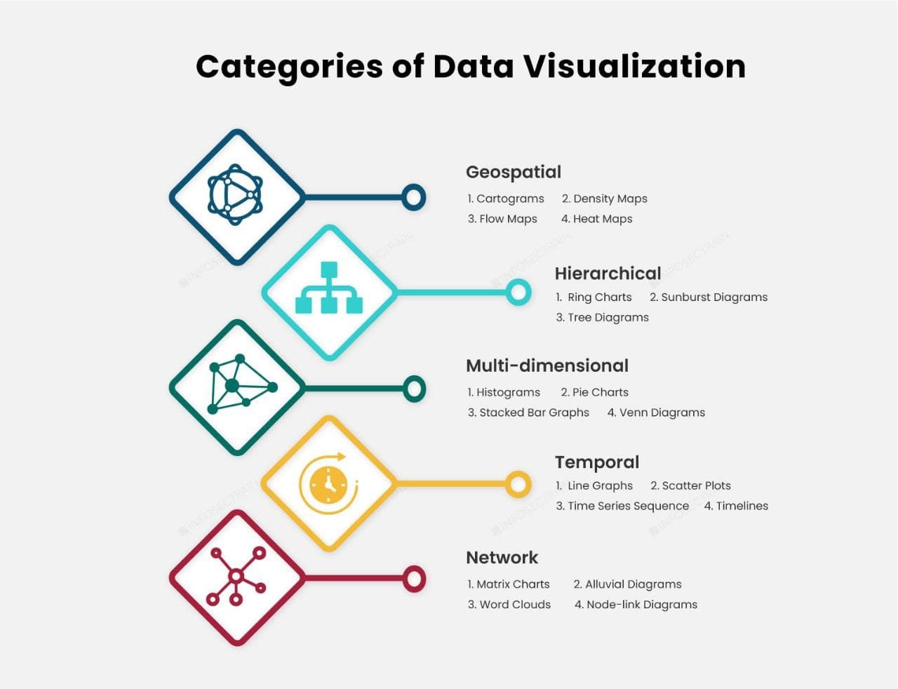
Effective Chart Types for Employment Trend Analysis
Line Graphs
Line graphs are ideal for showing job market trends over time. For example, a line graph can illustrate the changes in the unemployment rate over the past decade. By adding multiple lines, it’s possible to compare trends across different regions or industries. This helps to identify long-term trends and seasonal patterns in the workforce.
Bar Charts
Bar charts are effective for comparing data across categories. For instance, a bar chart can compare the average salaries across different job sectors or the number of job openings in various cities. Stacked bar charts can further break down data to show the distribution within each category, such as the proportion of full-time versus part-time jobs.
Heat Maps
Heat maps use color to represent data values, making them useful for showing geographic data. A heat map of the labor market can reveal which regions have the highest job growth or the lowest unemployment rates. This visual representation helps policymakers and businesses to identify areas that require more attention or investment.
Scatter Plots
Scatter plots are used to show the relationship between two variables. In employment analysis, a scatter plot can be used to analyze the correlation between education levels and employment rates, or between technological adoption and job growth. By plotting data points, it’s possible to identify trends and outliers that might warrant further investigation.
Bubble Charts
Bubble charts add a third dimension to scatter plots by varying the size of the data points. This makes them useful for showing the relative impact of different factors. For example, a bubble chart can illustrate the relationship between job growth, average salary, and the number of job openings in different industries. Larger bubbles can represent industries with higher job growth.
Dashboards
Dashboards combine multiple visualizations into a single interface, providing a comprehensive view of employment data. They allow users to interact with the information, drill down into specific details, and customize the view according to their needs. For example, a labor market dashboard might include a combination of line graphs, bar charts, and heat maps to provide a holistic view of employment trends.
Source: Infosectrain
Data Visualization Examples for Employment Trends
Unemployment Trends
A line graph showing the unemployment rate over the past decade can reveal long-term trends and seasonal fluctuations. By adding annotations for significant events, such as economic recessions or policy changes, it’s possible to provide context and insights into the factors influencing these trends.
Industry Comparison
A bar chart comparing job growth rates across different industries can highlight which sectors are expanding and which are contracting. This information is valuable for job seekers deciding on career paths, as well as for policymakers aiming to support struggling industries.
Geographic Analysis
A heat map displaying job growth rates by region can reveal geographic disparities in employment opportunities. For example, such a map might show that coastal regions are experiencing higher job growth due to tech industry expansion, while rural areas are lagging behind.
Education and Employment
A scatter plot analyzing the relationship between education levels and employment rates can provide insights into the value of higher education in the labor market. This can inform educational institutions and policymakers about the areas where investment in education is most needed.
Impact of Technology
A bubble chart showing the relationship between technological adoption, job growth, and average salary in different industries can reveal the impact of technology on employment. For example, industries with higher technological adoption might show higher job growth and salaries, highlighting the importance of tech skills in today’s job market.
Conclusion
Data visualization is an invaluable tool for interpreting complex job market trends. It simplifies data, enhances comprehension, facilitates comparison, and reveals hidden insights. By using effective visualizations such as line graphs, bar charts, heat maps, scatter plots, and bubble charts, stakeholders can gain a deeper understanding of employment patterns and make informed decisions. As the job landscape continues to evolve, data visualization will play a crucial role in helping us navigate and interpret the job market trends that shape our world.
Incorporating data visualization into labor analysis not only makes the data more accessible but also empowers stakeholders to make data-driven decisions. Whether you are a job seeker, employer, policymaker, or researcher, leveraging the power of data visualization can provide you with the insights needed to navigate the complex landscape of employment trends. Jobspikr plays a pivotal role in this process by providing rich, detailed employment data that is crucial for creating accurate and meaningful visualizations. To see how Jobspikr can enhance your understanding of job market trends, sign up for a demo.