- **TL;DR**
- What is a workforce planning template? (and why static sheets fall short)
- What’s inside the free Google Sheets template (tab-by-tab)
- How the live job-market lookups work (JobsPikr API inside Sheets)
- Step-by-step setup guide (from blank copy to live model)
- Stop Planning Blind. Start Planning Live.
- Using labor market data to improve forecast accuracy
- Scenario planning you can actually defend (three practical examples)
- Capacity modeling 101 (simple math, big clarity)
- Governance: keep the sheet clean, compliant, and useful
- Who should use this workforce planning tool (and when)
- Turning Workforce Planning from Guesswork into a Living System
- Stop Planning Blind. Start Planning Live.
- FAQs
**TL;DR**
Most workforce planning templates look good for a week. Then market reality punches holes in them. Salaries move, time-to-fill drags, and suddenly your Q2 hiring plan is a Q3 problem. That’s why we built a free Google Sheets–based workforce planning template that connects to live job-market data through the JobsPikr API.
Instead of static assumptions, it pulls real numbers, posting velocity, salary bands, and location trends straight into your model. So, when the job market shifts, your plan shifts with it.
This template isn’t another budget tracker. It’s a practical workforce planning tool for HR Ops and FP&A teams who need their numbers to hold up under scrutiny. You can model scenarios, adjust headcount forecasts, and see capacity implications without opening another tab of stale compensation data.
Get the sheet, connect your API key, and plug labor market data right where your planning happens.
What is a workforce planning template? (and why static sheets fall short)
The phrase “workforce planning template” gets thrown around a lot. Most of the time, it’s just a glorified spreadsheet with headcount numbers, a few formulas, and a tab for costs. That works fine when your hiring environment is stable. But real labor markets don’t sit still. Salaries move faster than most planning cycles. Some roles disappear overnight. And a hiring freeze in one region can ripple through your entire forecast.
Definition: workforce planning vs. headcount tracking
A workforce planning template isn’t the same as a headcount tracker. Headcount tracking tells you what you have today. Workforce planning projects what you need tomorrow — and what it will take to get there. It combines role forecasts, cost models, hiring velocity, and timing. For HR Ops and FP&A, it’s the backbone of strategic planning.
A solid workforce planning tool isn’t just a static table. It should help answer questions like:
- How many people do we need to hire to support next quarter’s product launch?
- How long will it take to fill those roles in different markets?
- How much will that cost us with current salary trends?
Where traditional spreadsheets miss the mark
Traditional workforce planning spreadsheets rely on fixed assumptions. You set a salary band in January and hope it holds till June. You plug in an average time-to-fill and hope your recruiters hit it. You model hiring ramp-up without accounting for local job-market scarcity.
That’s the gap. Labor markets move fast. If your template doesn’t update, your plan drifts away from reality.
The fix: live job-market analytics inside your sheet
This is where live labor market data changes the game. Instead of pulling salary benchmarks once a year, you pipe them in weekly. Instead of guessing time-to-fill, you watch actual posting velocity by role and region.
With live job market analytics flowing into your workforce planning template, your numbers stay grounded in reality. You see hiring pressure as it builds. You adjust before missed targets pile up.
This approach turns workforce planning from an annual exercise into an operational system. A template that earns its place in your planning stack.
What’s inside the free Google Sheets template (tab-by-tab)
A good workforce planning template doesn’t just store numbers. It guides how decisions are made. Every tab in this Google Sheet is built to answer a specific planning question: what’s needed, when, where, and at what cost. You can plug in your assumptions, but more importantly, you can override them with live job-market signals.
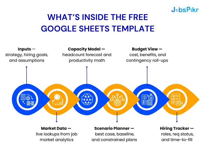
Inputs — strategy, hiring goals, and assumptions
This is your single source of truth for all baseline planning inputs. Instead of hiding assumptions in formulas, they sit upfront on one clean tab. You define job families, levels, geographies, and your strategic priorities for the planning cycle.
It’s built for clarity. If you’re targeting 120 hires across three markets with staggered start dates, those assumptions live here. When anything changes—scope, timing, or priorities—this is the only place you update. Every downstream tab recalculates automatically.
Market Data — live lookups from job market analytics
This is the engine. The template connects to JobsPikr’s job market analytics feed, which pulls real-time insights like posting velocity, salary benchmarks, and competitive hiring pressure.
For example, if you’re planning to hire 15 backend engineers in Berlin, the tab fetches median salaries, average time-to-fill, and volume of active postings in that market. Instead of relying on last year’s comp survey, you get live signals from the current market.
Capacity Model — headcount forecast and productivity math
This tab converts headcount numbers into operational capacity. If one engineer can support X units of output, the model rolls up total team capacity by quarter.
It lets FP&A and HR Ops stress-test assumptions. If hiring lags by four weeks, the capacity curve adjusts. If you expand hiring in another market, the model reflects different ramp-up times and cost curves. It’s a clear bridge between hiring plans and business outcomes.
Scenario Planner — best case, baseline, and constrained plans
Hiring rarely goes exactly as planned. This tab makes scenario planning real, not theoretical. You can toggle between a best case (everything on time), baseline (planned speed), and constrained (delays or freezes).
Each scenario updates your forecast automatically. If average time-to-fill stretches from 30 to 45 days, your ramp timelines shift across the sheet. This is what lets you model operational risk before it becomes a fire drill.
Budget View — cost, benefits, and contingency roll-ups
Here’s where the numbers meet the CFO. The Budget tab aggregates salary costs, benefits, overhead, and contingency buffers by month and quarter.
Because salary benchmarks are live, you see the impact of market drift on budget in real time. A 5% increase in salary for a critical role doesn’t catch you by surprise—it surfaces right here.
Hiring Tracker — roles, req status, and time-to-fill
This last tab is for operational visibility. It’s where talent teams track progress against plan: what’s open, what’s filled, how long it’s taking, and whether you’re trending ahead or behind.
It’s tied back to market data. If competitors start hiring aggressively for the same roles, your forecasted time-to-fill adjusts. That’s the edge: less guesswork, more signal.
How the live job-market lookups work (JobsPikr API inside Sheets)
The smartest part of this workforce planning template isn’t the formulas. It’s the live data flowing into it. Traditional planning templates rely on a static spreadsheet—you set it and forget it. This one stays connected to the real world through the JobsPikr API, which feeds it job-market signals as they change.
The data you’ll pull: titles, locations, salaries, posting velocity
At its core, the JobsPikr API is built to surface real-time job market analytics. You can fetch metrics for any role or geography you’re planning for:
- Titles and job families — to match planned roles against current market demand.
- Locations — to see how hiring timelines and costs vary across geographies.
- Salaries — median, min, max, and percentiles so you can plan with confidence, not guesswork.
- Posting velocity — how many companies are hiring for the same role right now, which directly affects your time-to-fill.
If you want to know how long it will actually take to fill a senior product manager role in London or a machine learning engineer in Bangalore, the API gives you those numbers in seconds.
Connecting a secure API key in Apps Script
We built the template so the integration doesn’t require engineering support. All you need is a secure API key, which you paste into the Apps Script editor linked to your sheet. A simple script fetches the required data on demand, parses the response, and drops it into the Market Data tab.
No fancy dashboards, no external tools. Just your sheet, pulling fresh job market intelligence when you need it.
Refresh cadence, caching, and rate-limit hygiene
You can set your own refresh cadence, daily, weekly, or manual pulls before each planning review. The script uses lightweight caching to avoid unnecessary calls and keep the sheet fast.
If you’re modeling for multiple markets or job families, this approach keeps the data clean and reliable without running into rate limits. Think of it as your private data pipe between the labor market and your planning model.
This live lookup layer is what turns a standard spreadsheet into a living workforce planning tool. Instead of updating assumptions twice a year, you get continuous signals that keep your plan honest.
Step-by-step setup guide (from blank copy to live model)
You don’t need to be an engineer to make this workforce planning template work. If you can use Google Sheets, you can get this up and running in less than an hour. Here’s how to turn the blank template into a live, data-powered model for your team.
Step 1 — Make a copy and unlock editable ranges
Start by making your own copy of the Google Sheet. This gives you full control to customize formulas, naming conventions, and permissions. Then unlock only the input cells you actually need to touch. Everything else runs off calculated fields. It keeps your sheet clean, stable, and easy to hand off to others.
Step 2 — Drop in your job families and levels
Go to the Inputs tab and define the structure of your workforce plan. List out job families, seniority levels, and hiring targets for each role. Keep it simple and structured. This is the foundation the rest of the model uses to calculate costs, capacity, and timelines.
If your organization is planning across multiple regions or functions, use consistent naming. It’ll make your API lookups and capacity modeling far smoother.
Step 3 — Add locations and salary bands
Next, map each job family to its location and your internal salary bands. This is where live market data will come into play later. When the sheet pulls in fresh salary benchmarks from JobsPikr, you’ll immediately see how your planned bands compare to the market.
Step 4 — Connect JobsPikr API calls for live market data
This is the fun part. Open the Apps Script editor in Google Sheets, paste your secure API key, and run the prewritten script included in the setup file. It fetches live job-market analytics for your selected roles and geographies.
Within seconds, the Market Data tab populates with posting velocity, median salaries, and time-to-fill estimates. Those numbers flow downstream into your capacity and budget models automatically.
Step 5 — Validate the feed and sanity-check outliers
Don’t just trust the first pull. Labor markets are noisy. Validate whether the numbers make sense. If salary medians look far off from your internal data, check your filters—sometimes overly broad role titles can skew results. Adjust parameters and rerun.
This sanity check is what separates an accurate workforce plan from a pretty spreadsheet.
Step 6 — Turn on auto-refresh and versioning
Finally, set your refresh cadence. Most teams choose a weekly update, right before planning or forecast syncs. Turn on version history so you can roll back if something breaks or compare how assumptions changed over time.
This step locks in your live data pipeline without turning the sheet into a mess. Once it’s set up, your workforce plan will stay in sync with the real market without manual number wrangling.
Stop Planning Blind. Start Planning Live.
Hook your workforce planning sheet to real-time job-market data in under an hour.
Using labor market data to improve forecast accuracy
Forecasting headcount isn’t just about how many people you plan to hire. It’s about when you can actually hire them, at what cost, and how those variables shift as the market moves. That’s where live labor market data inside your workforce planning template becomes a real advantage, not just a nice-to-have.

Time-to-fill by role and region: modeling hiring velocity
Time-to-fill is one of the most misunderstood metrics in workforce planning. Most templates hardcode a single number: 45 days. But in the real world, that varies wildly. A software engineer in Berlin might take 28 days to hire, while a cloud architect in Singapore might take 70.
By pulling posting velocity data from JobsPikr, your sheet can adjust time-to-fill based on what’s happening in the market right now. If demand for a specific role spikes, the velocity number goes up, your fill time extends, and your ramp forecast adjusts. No more “best guess” numbers that fall apart mid-quarter.
Compensation drift: adjusting bands to market movement
Salary drift is another silent killer of workforce plans. You budget for one number and end up paying another. Instead of discovering this after offers are accepted, the template pulls salary benchmark data weekly or monthly.
When median salaries shift in a given market, your Budget View tab reflects the new cost. If your comp plan is below market, it’s a clear signal to review your band or rethink your location strategy before you blow through your budget.
Mercer’s Global Compensation Report (2024) showed salary inflation of 4.9% globally, with some markets peaking at 9% in specific tech domains. This is exactly why locking your numbers in January and hoping for the best is a losing strategy.
Requisition volume signals: when to widen sourcing
Job postings don’t just reflect demand—they predict friction. If a role has very high posting volume across competitors, it’s a warning sign that your recruiting team may face sourcing challenges.
With this signal flowing directly into your workforce planning tool, you can model what happens if hiring takes longer or requires additional locations. This is how HR Ops and FP&A teams stay ahead of surprises instead of reacting to them.
Live market data doesn’t just make forecasts more accurate. It makes them defensible. When someone asks, “Why is our time-to-fill assumption 65 days?” you’re not guessing. You’re pointing to live market trends that back your plan.
Scenario planning you can actually defend (three practical examples)
Workforce plans rarely play out exactly as drafted. A role that looked easy to hire for suddenly takes three months. A salary band you thought was safe gets blown up by a competitor’s offer. Scenario planning isn’t a “nice extra” here — it’s the only way to keep your headcount plan credible.
This template bakes scenario planning into the core model. You can toggle between best case, baseline, and constrained views without building separate spreadsheets. Here’s what that looks like in practice.
High-growth plan: ramping up a product launch with scarce skills
Let’s say you’re launching a new product line and need to ramp up engineering, design, and customer success roles fast. In a best-case scenario, time-to-fill is steady, salaries hold, and ramp targets are met on schedule.
But the live job-market feed tells you backend engineering postings in your chosen region have spiked 40% in the last 60 days. That’s a signal. You switch the scenario to “high market competition,” and the model automatically extends your hiring timeline by three weeks, increases your salary forecast, and shifts capacity curves forward.
That’s not just a spreadsheet update. It’s how your launch timeline gets pressure-tested before it falls apart in execution.
Cost-guardrail plan: holding budget while shifting locations
Budget isn’t elastic, even when the market is. Say your hiring budget is fixed for the year, but live salary benchmarks for senior roles jump 10% in your primary market. Instead of blowing through your cap, you test a location shift scenario.
The template lets you model the impact of hiring 30% of your roles in an alternate region where salary benchmarks are lower and hiring velocity is faster. FP&A can instantly see how that affects spend curves and capacity output.
This is how HR Ops and Finance start working from the same playbook instead of speaking different languages.
Risk-buffer plan: attrition spikes and hiring freeze contingencies
Every good workforce plan needs a downside scenario. If attrition spikes or a temporary hiring freeze hits, how long can your team sustain delivery?
With this scenario, you can model slower backfills, extended vacancy periods, or paused hiring waves. It shows how your capacity and cost projections shift under pressure. More importantly, it gives leadership a realistic plan B—not a scramble at the last minute.
This is what separates a planning spreadsheet from a workforce planning tool. Scenarios aren’t afterthoughts; they’re built into the system, powered by live labor market data, and directly tied to capacity and budget models.
Capacity modeling 101 (simple math, big clarity)
Headcount numbers alone don’t tell you much. What matters is the capacity those people generate—how many projects they can ship, how many customers they can support, how many deliverables they can own. This is where most workforce planning templates fall short: they stop at hiring targets. This one goes further.
From headcount to output: capacity per FTE and ramp curves
Every role has a different productivity curve. A support agent might be fully ramped in two weeks. A senior engineer might take three months. When you model capacity, you’re not just adding people to a table—you’re translating hiring velocity into operational output.
The capacity tab in the template uses role-specific ramp curves and FTE contribution rates. So when a new hire joins, capacity builds gradually, not instantly. If hiring is delayed, the downstream impact on delivery shows up right away.
For example, If 10 engineers are planned to start in April but hiring slips to June, the capacity curve flattens. Your Q3 delivery targets shift without anyone needing to manually adjust a Gantt chart.
Backfilling vs. net-new: avoiding double-counting
One of the biggest planning errors is mixing backfills with net-new headcount. The template separates both automatically. If someone leaves and the plan includes a backfill, capacity stays flat during the vacancy period, then rebuilds on the ramp curve once the new hire joins.
Net-new headcount, on the other hand, adds incremental capacity to the forecast. This distinction is critical for realistic planning. Without it, you end up overpromising delivery capacity based on inflated headcount assumptions.
How often to re-baseline with fresh labor market data
Workforce plans aren’t meant to be static. A realistic model needs a regular re-baseline cycle, ideally monthly or quarterly. Live labor market data makes this easy. When time-to-fill or salary benchmarks shift, your capacity and cost models update in real time.
That’s how HR Ops and FP&A can keep forecasts sharp without doing another all-nighter in Excel. It’s also how leadership gets better visibility into what’s actually achievable—not what was guessed six months ago.
Capacity modeling isn’t about adding complexity. It’s about giving your workforce plan teeth. A hiring plan that doesn’t map to real capacity isn’t a plan; it’s a list.
Governance: keep the sheet clean, compliant, and useful
A workforce planning template can become useless fast if it’s not managed properly. The best models don’t fail because of bad math—they fail because no one knows what changed, who edited what, or whether the numbers are still trustworthy. Governance isn’t glamorous, but it’s the backbone of keeping your plan credible.
Access control, PII hygiene, and audit notes
Start with access. Not everyone in your org should have full editing rights. HR Ops, FP&A, and recruiting may need different levels of control. Lock down formula ranges, protect the API script, and clearly mark editable fields.
This isn’t about gatekeeping—it’s about preventing accidental chaos. One overwritten cell can quietly distort months of forecast data.
And because workforce plans may include salary ranges and compensation data, treat it like sensitive information. Make sure personally identifiable information (PII) doesn’t make its way into shared views. Keep it strictly at the role and band level, not individual names.
Change logs, version history, and quarterly revalidations
Even the best planning model is only as good as its audit trail. Use Google Sheets’ built-in version history to track who changed what and when. For significant plan adjustments—like updated hiring targets or location shifts—log a quick note in a dedicated “Change Log” tab.
This creates institutional memory. If someone asks why a headcount number moved from 25 to 32, you won’t have to dig through old emails. It’s right there in the record.
Quarterly revalidations are another overlooked step. Labor market conditions change fast, and so do internal priorities. A quarterly “plan check” ensures your model still reflects reality and isn’t just a dusty spreadsheet.
Hand-off checklist for HR Ops and FP&A
Workforce planning is a shared responsibility. HR Ops brings talent pipeline data, FP&A brings financial guardrails, and business teams bring demand signals. A hand-off checklist between these groups ensures the sheet doesn’t become a black box.
The checklist covers:
- When to refresh the live data feed
- How to log changes and maintain audit trails
- Which metrics are reviewed in each planning cycle
- Who owns the final approval on assumptions
With clear governance, the template stops being “someone’s spreadsheet” and becomes a shared planning system. Everyone trusts the numbers, and that trust is what makes the model powerful.
Who should use this workforce planning tool (and when)
Not every tool fits every team. But this particular workforce planning template was designed for the people who actually live inside planning cycles—those who need accuracy, not just pretty charts. If you’re constantly juggling hiring targets, budgets, and delivery timelines, this is built for you.
HR Ops: for strategic workforce planning that holds up
HR Ops teams live in the messy middle between recruiting realities and leadership expectations. They’re the ones who get blamed when a plan slips and are rarely the ones who set the assumptions in the first place.
With live labor market data baked into the template, HR Ops can see trouble before it hits. If market posting velocity spikes or salaries drift up, the model surfaces those shifts early. That means they can adjust forecasts proactively, not react after missing targets.
It also gives them a single source of truth. No more fighting over which spreadsheet is “the real one.” The template reflects live data, not stale numbers buried in email threads.
FP&A: for pressure-testing hiring assumptions
For FP&A, this template is a way to make workforce costs defensible and dynamic. Instead of getting locked into a January budget that ignores market movement, FP&A can model multiple scenarios in real time.
If comp in your primary market goes up 10%, you’ll see how that hits your run rate and margins immediately. If hiring slows by three weeks, your cost curve shifts with it.
This level of forecasting clarity gives finance teams the confidence to plan with agility, not rigidity.
Talent leadership: for aligning recruiters to reality
Talent teams are usually stuck trying to fill roles defined by plans that don’t match market reality. This template closes that gap.
Because it pulls from real-time job market analytics, recruiters can align their sourcing strategies with what’s actually happening outside the company. They can see which roles will be hardest to fill, where salary pressure will be strongest, and where location strategy might give them leverage.
The result: fewer surprises, better alignment between recruiting capacity and business expectations.
Turning Workforce Planning from Guesswork into a Living System
Most workforce plans fail not because the math was wrong, but because the assumptions went stale. Salaries shift, markets tighten, hiring slows, and spreadsheets quietly drift into irrelevance. This template was built to solve exactly that problem.
By plugging real-time labor market data directly into your workforce planning process, you stop chasing outdated assumptions and start working with what’s actually happening out there. Hiring velocity, salary benchmarks, and market demand signals aren’t static inputs—they’re real-time levers.
HR Ops can stay ahead of hiring slowdowns. FP&A can pressure-test budgets with live data instead of blind hope. Talent teams can see where to shift strategy before the funnel dries up. And leadership gets a plan that holds up under scrutiny, not a PowerPoint fantasy.
This isn’t just a workforce planning template. It’s a way to build a living, breathing planning system that keeps pace with the market.
Stop Planning Blind. Start Planning Live.
Hook your workforce planning sheet to real-time job-market data in under an hour.
FAQs
1. What makes this workforce planning template different from a regular spreadsheet?
Most spreadsheets are static—they freeze the assumptions you made months ago. This one doesn’t. It pulls live labor market data into your plan, so when salaries jump, hiring velocity shifts, or competitor demand spikes, your model moves with it. You don’t have to chase stale numbers or redo your plan every quarter. It adapts as the market does.
2. How often should I refresh the live job-market data?
There’s no one-size answer. Most HR Ops and FP&A teams refresh weekly before forecast syncs or headcount reviews. Some prefer monthly cycles. The point is: you don’t have to rebuild anything. Hit refresh, and your salary, posting velocity, and time-to-fill assumptions update automatically.
3. Do I need an engineer to set this up?
Nope. It’s built for operators, not coders. You paste your API key into a simple Apps Script in Google Sheets, and you’re done. The data starts flowing into your Market Data tab without dashboards, middleware, or IT bottlenecks. If you can use Sheets, you can set it up.
4. What if our internal salary bands don’t match market numbers?
That’s actually the point. When the market moves away from your internal bands, this template shows you how big the gap is—and what it’ll cost you. You can adjust your hiring strategy early, before offers start falling through or budget overruns pile up.
5. Who typically uses this template inside a company?
Three teams benefit most:
HR Ops — to keep plans aligned with hiring realities.
FP&A — to model costs and budget against live market pressure.
Talent teams — to understand where hiring will actually get tough.
They all get to work off one shared source of truth instead of juggling five spreadsheets that never agree.