- The Gender Pay Gap in 2026: What 2.3M+ Job Posts Actually Reveal
- The Gender Pay Gap Is Still Here, And Most Data Is Missing the Point
- Is Your Pay Data Keeping Up With the Market?
- Why Job Posting Salary Data Cuts Closer to the Truth on Pay Equity
- Gender Pay Gap by Region: What the Numbers Actually Reveal
- See How Pay Equity Varies Across Markets in Real Time
- Gender Pay Gap by Industry: Which Sectors Have the Widest Gap?
- Seniority Makes It Worse: How the Gender Pay Gap Compounds as Women Move Up
- From Insight to Action: How DEI Leaders Are Using Pay Equity Data
- The Gender Pay Gap Will Not Close Itself But Better Data Is a Real Starting Point
- See How Pay Equity Varies Across Markets in Real Time
- Frequently Asked Questions About the Gender Pay Gap
The Gender Pay Gap in 2026: What 2.3M+ Job Posts Actually Reveal
The gender pay gap is not a myth, and it is not solved. What most organizations are missing is not awareness, but the right data. Annual surveys and self-reported compensation studies are structurally slow and easy to game.
Job posting salary data, drawn from over 2.3 million real listings, tells a more honest story: gaps exist across every region, every industry, and every seniority level, and they tend to get worse the higher up the ladder you look.
This article breaks down what that data reveals, where the gaps are most pronounced, and what DEI and HR leaders can do with better pay equity data to start closing them.
The Gender Pay Gap Is Still Here, And Most Data Is Missing the Point
Let’s be honest about something. The gender pay gap conversation has been happening for decades, and most people in HR and DEI have heard the headline numbers so many times that they have started to blur. It shows up in every diversity report, every Women’s History Month post, every congressional hearing. And yet, according to the World Economic Forum’s Global Gender Gap Report 2025, the world is still an estimated 123 years away from full economic parity between men and women. That is not a typo.
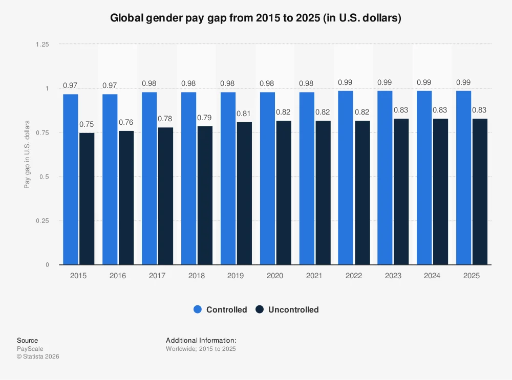
Image Source: Statista
So, what is going wrong? Why, after years of awareness campaigns, pay transparency legislation, and DEI commitments from enterprises large and small, does the needle move so slowly?
Part of the answer is straightforward: the data most organizations rely on to understand their own pay gap is not built for action. It is built for reporting.
Here is what is structurally broken about how most pay gap data is collected:
- It relies on memory and self-disclosure. Employee surveys and annual compensation studies capture what people remember being paid, or what HR managers chose to report. Neither is particularly reliable.
- It is always playing catch-up. By the time data is collected, cleaned, analysed, published, and read, the market has already moved. The Pew Research Center found that in the United States, women earned 82 cents for every dollar earned by men in 2022, useful as a benchmark, but it tells a comp team almost nothing about what is happening in their specific sector or city right now.
- The “adjusted” gap is doing a lot of heavy lifting. When companies voluntarily disclose pay data, unadjusted gaps often get “adjusted” for factors like hours worked, job function, and seniority. Sometimes that is legitimate. Sometimes it is a way of explaining away the gap without addressing it.
This is where job posting salary data changes the equation. When a company posts a role with a salary range, that number reflects what they are genuinely prepared to offer in a competitive market. It is not a survey response. It is a live signal of what employers value, and when you aggregate that signal across 2.3 million+ postings, patterns emerge that self-reported data simply cannot surface.
Hiring bias and gender bias do not always look the way people expect. They are rarely overt. More often, they are baked into how roles are defined, leveled, and compensated before a single candidate ever applies. Job posting data surfaces those structural patterns:
- Which sectors consistently post lower salary ranges for roles dominated by women
- Which geographies show the widest spread between comparable titles
- Which seniority levels show the sharpest divergence as you move up the ladder
These are the questions annual surveys are not designed to answer. But pay equity data drawn from real job postings can, and that is exactly what the rest of this article gets into.
Is Your Pay Data Keeping Up With the Market?
Real-time job posting data gives you the benchmark surveys never could.
Why Job Posting Salary Data Cuts Closer to the Truth on Pay Equity
Most pay equity analyses start with a survey. A company sends out a questionnaire, HR managers fill it in, a third-party firm aggregates the responses, and six months later, a report lands in your inbox telling you what compensation looked like last year. By the time you are reading it, the data is already stale.
This is not anyone’s fault. It is just how traditional compensation research works, and for a long time, it was the best tool available. But the structural limitations are real, and in a market where pay transparency laws are changing by the quarter and hiring conditions shift fast, those limitations matter.
The three biggest problems with survey-based pay gap data:
- Sample sizes are smaller than they look. Many widely cited compensation studies draw from a few thousand respondents at most. When you start cutting that data by gender, sector, seniority, and geography simultaneously, which is what you need to do to understand a pay gap properly, the sample size for any given slice gets thin very quickly, and the margin of error grows.
- Participation is voluntary, which creates selection bias. Companies with stronger pay equity records are more likely to participate in compensation benchmarking surveys. Companies with wider gaps are more likely to quietly opt out. The result is a dataset that skews toward the best performers, which means the average looks better than reality.
- There is no way to verify the numbers. A survey respondent can report whatever figure they choose. There is no mechanism to cross-check whether what was reported reflects what was offered or paid.
Job posting data does not have these problems. When a company publishes a salary range on a job listing, that is a public, verifiable commitment to the market. It reflects what they are willing to pay a new hire in current conditions, not what they reported on a form last spring. And when you pull that data at scale across 2.3 million+ postings spanning multiple sectors, geographies, and seniority levels, you get a picture of pay equity that is both broader and more current than anything a survey can produce.
This kind of data is particularly powerful for spotting hiring bias before it becomes a legal or reputational problem. Salary ranges embedded in job postings reveal how employers value roles at the point of hire, which is often where gender pay gaps first take root. A role that skews female gets posted with a lower range. A leadership title that skews male gets a wider band with more upside. These patterns are visible in the posting data in ways they rarely are in internal HR reports.
That is the foundation this analysis is built on, and it is why the regional and sector-level breakdowns in the sections ahead are worth paying attention to.
Gender Pay Gap by Region: What the Numbers Actually Reveal
The gender pay gap is not one problem. There are many problems wearing the same name, and depending on where in the world you are looking, the size, shape, and root cause of that gap can be completely different. Job posting data makes this visible in a way that global averages simply cannot. Here is how the picture breaks down region by region.

Image Source: OECD
North America
North America sits among the regions that have made the most measurable progress on paper. The two economies in North America have closed over 5.2 percentage points of their overall gender gap since 2006, moving at an average annual pace of 0.3 percentage points per year, which sounds encouraging until you realize that at that pace, the region as a whole is still an estimated 89 years away from full parity.
At the job posting level, the gaps in North America tend to be less about flat pay discrimination and more about how roles are structured and leveled. Salary ranges for leadership roles skew wider and higher in sectors like finance and technology, where men remain overrepresented at senior levels. In the United States, women earned 83.6% of what men earned in 2024, a modest improvement from prior years, though for younger workers aged 25 to 34, the gap narrows to 95 cents on the dollar. That narrowing at the entry level is real progress, but it also tells you something important: the gap does not disappear as women age and advance. It widens. This points directly to a seniority and leadership problem, not just a hiring one.
Canada tracks, similarly, with pay transparency legislation beginning to surface more granular data from employers. The practical effect of posting salary ranges is that it makes the gap harder to hide, which is a feature, not a bug, for any organization serious about pay equity.
Europe
Europe is home to the most gender-equal economies in the world by most measures. Iceland, Finland, Norway, and Sweden have consistently ranked in the global top 10 for gender parity in every edition of the WEF index since 2006, with Iceland remaining the only economy to have closed more than 90% of its gender gap. For DEI leaders benchmarking against best-in-class, these Nordic markets are the reference point.
But Europe is not the Nordics. The EU average gender pay gap sits at around 13%, in part supported by pay transparency rules, but that average masks significant variation between member states. Eastern Europe and Southern Europe continue to show wider gaps, particularly in private sector roles. The EU Pay Transparency Directive, which came into force in 2023, is pushing companies to publish salary ranges and report pay gap data by gender, which means job posting data from European markets is becoming richer and more standardized as a source for equity analysis.
Asia-Pacific
This is where the picture gets most complicated. The Asia-Pacific region covers an enormous range of economic development, labor market structures, and cultural contexts, and the gender pay gap data reflects that. Eastern Asia and the Pacific have closed only 3.3 percentage points of its gender gap since 2006, the slowest rate of improvement of any region, and at the current pace, is not projected to reach parity for another 179 years.
Japan is often cited as a particularly sharp example of structural gender disparity in a high-income economy. Japan’s adjusted gender wage gap sits at around 25% meaning even when you control for job function and seniority, a meaningful gap persists. The reasons are structural: long-hours work culture, limited childcare infrastructure, and a corporate ladder that was built around uninterrupted career progression, which disproportionately disadvantages women.
Elsewhere in the region the story varies. Australia, for instance, has made meaningful legislative strides, with the Workplace Gender Equality Agency publishing employer-level pay gap data publicly since 2023. Despite this, women in Australia still earned around 83% of men’s average earnings in 2024. In emerging markets across South and Southeast Asia, lower female labor force participation rates compound the wage gap, making the headline number only part of a much larger picture.
Middle East and North Africa
The MENA region consistently records the widest gender gaps of any region globally, and the data tells you why quickly. Female labor force participation in MENA sits at around 19% the lowest of any region in the world. When women are largely absent from the formal workforce, the pay gap becomes almost secondary to the participation gap. A woman cannot have a pay gap in a job she was never hired for.
That said, some movement is happening. Gulf countries have been pushing female workforce participation as part of broader economic diversification efforts Saudi Arabia’s Vision 2030 and the UAE’s gender balance initiatives have resulted in measurable increases in women entering formal employment. But as analysts note, a gender wage gap persists in these markets, and bringing more women into the workforce does not automatically close the pay gap if those women are being channelled into lower-paying roles.
Latin America and Sub-Saharan Africa
These two regions are worth addressing together because they share a common pattern: headline progress that masks deep structural problems. Latin America and the Caribbean has advanced the most of any region since 2006, closing 8.6 percentage points of its gender gap at an average annual pace of nearly half a percentage point. That is real, and it is worth acknowledging. But at the current rate, the region is still 57 years away from full parity, and the progress is uneven across countries and sectors.
In Sub-Saharan Africa, high informality rates in employment, where large portions of the workforce operate outside formal wage structures, make pay gap measurement difficult. In many African and Latin American markets, gaps often exceed 20% and are closely tied to sectoral structures and informality rates. Job posting data in these markets is less comprehensive than in North America or Europe, which itself is a signal: where pay transparency infrastructure is weakest, the gaps tend to be widest.
See How Pay Equity Varies Across Markets in Real Time
JobsPikr’s salary benchmarking tool lets you cut pay equity data by region, sector, and seniority, all from live job postings.
Gender Pay Gap by Industry: Which Sectors Have the Widest Gap?
If you want to understand where the gender pay gap lives, you have to stop looking at economy-wide averages and start looking at industries. The overall “women earn X cents on the dollar” figure is a useful headline, but it flattens enormous variation between sectors. Some industries have gaps so wide they border on structural discrimination. Others are genuinely closer to parity than most people realize. Job posting salary data makes this sector-level picture visible in a way that aggregate stats simply do not.
Here is how the major sectors break down.
Finance and Insurance
Image Source: ElectroiQ
This is, consistently, the worst-performing sector for gender pay equity and the data is not even close. Women make up over half the workforce in the US finance and insurance industry, yet they earn just 63 cents on the dollar compared to men, according to Census Bureau data. That is not an adjusted figure accounting for role differences. That is the raw reality of what women in that industry take home relative to their male colleagues.
Payscale’s 2025 Gender Pay Gap Report also flags finance jobs among the top roles with the widest controlled gender pay gaps, meaning even when you compare women and men doing the same job with the same qualifications, a gap persists. This is one of the clearest signals of hiring bias in the data: the problem is not just occupational segregation; it is how the industry values the same work differently depending on who is doing it.
Technology
Image Source: windo
Tech is a sector where the pay gap and the participation gap feed each other in a way that makes both harder to solve. Women make up only about 28.2% of the STEM workforce, which means they are already underrepresented before you even get to the question of what they are being paid. In technology and professional services, women earn around 73% of what men earn a gap that reflects both direct pay differences and the concentration of women in lower-paying roles within the sector.
The leadership pipeline problem is particularly visible in tech. Female representation in tech job applicant pools is highest for junior roles, drops at mid-level, and drops again at the senior level. When women are systematically less represented at each rung of the ladder, the average pay gap widens not because individual women are being underpaid for a given role, but because the overall distribution of who holds which roles is skewed from the start.
Healthcare
Healthcare is one of the more counterintuitive stories in pay equity data. Women make up 76% of the healthcare workforce, which might lead you to expect a relatively narrow gap, but that is not what the data shows. The sector has a well-documented split between the roles women tend to occupy and the roles that attract the highest compensation. Healthcare is among the industries seeing slower wage momentum, while the higher-paying end of healthcare, such as surgical specialties, senior management, and medical leadership, remains male-dominated in many markets.
The structural pattern here is worth naming directly: industries where women are the majority of workers are not the same as industries where women are paid equally. Healthcare is perhaps the clearest example of that distinction.
Education
Education sits in a similar position to healthcare. Women make up 52.9% of the education workforce globally, yet the sector consistently offers lower average wages than male-dominated industries of comparable complexity. This is not a coincidence. There are substantial academic evidence and a growing body of job posting data to support it that sectors become lower-paid as they become more female-dominated, a phenomenon sometimes called the “devaluation hypothesis.” The gender pay gap in education is therefore partly a within-sector pay gap and partly a reflection of how society values work that women predominantly do.
Manufacturing and Construction
These are the sectors where, perhaps surprisingly, the pay gap tends to be narrowest. In the US, women in construction earn around 95 cents for every dollar earned by men, one of the smallest gaps of any sector. This is largely because wages in these industries are heavily shaped by collective bargaining and union agreements, which compress pay ranges and reduce the room for individual-level pay discrimination.
The caveat is that narrow pay gaps in these sectors coexist with very low female participation rates. The issue is not that women in construction or manufacturing are paid unfairly relative to men, it is that very few women are in these sectors at all, which is its own form of gender bias embedded in hiring and workplace culture.
Retail and Services
Retail shows a relatively small gender pay gap of around 1.6% on an hourly basis in the UK, and similar patterns hold in other markets. But hourly pay figures in retail mask another problem: women are significantly more likely to work part-time in these sectors, which means annual income gaps are much wider than hourly gaps suggest. This is one of the clearest examples of why looking at job posting salary ranges, which reflect full-time equivalent compensation, gives a more complete picture than hourly wage statistics alone.
Seniority Makes It Worse: How the Gender Pay Gap Compounds as Women Move Up
Here is something that does not get talked about enough in pay equity conversations: the gender pay gap does not stay the same throughout a woman’s career. It grows. And it grows in a very specific, predictable pattern that job posting salary data makes remarkably visible.
Most entry-level salary ranges are relatively equitable. Companies posting junior roles tend to advertise tight bands with limited room for negotiation, which naturally compresses the gap at the bottom of the ladder. The problem is what happens next.
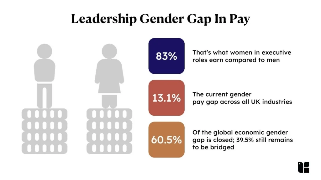
Image Source: Kapable
The Entry Level: Where the Gap Is Smallest
At the start of a career, the numbers look almost encouraging. Pay transparency legislation in markets like the US, UK, and EU is reinforcing this at the posting level. When salary ranges are visible to all candidates, the gap has less room to form. This is real progress, and it is worth acknowledging.
But this is also where a false sense of security can set in. A narrow entry-level gap does not mean the organization has solved its pay equity problem. It often just means the problem has not fully surfaced yet.
The Mid-Level Inflection Point: Where Things Start to Break Down
The mid-career years are where the gap begins to open up in earnest, and the data is consistent about why. According to McKinsey and LeanIn.Org’s Women in the Workplace 2024 report, for every 100 men promoted to manager, only 81 women are promoted, a “broken rung” in the corporate ladder that has barely moved since 2018. This is the period when caregiving responsibilities disproportionately affect women’s working patterns, and the gap in career progression that opens here rarely closes.
The compounding effect of falling behind at the manager level is not just slower salary growth. It is missed promotions, narrower salary bands, and the perception still embedded in how managers make advancement decisions that a woman who has taken a career break or shifted to part-time is a riskier candidate for a leadership track. Job posting data captures this indirectly: mid-level roles in sectors with high female participation show wider salary band spreads, suggesting employers are pricing in more negotiation room for candidates who are statistically more likely to be men.
The Senior Level: The Leadership Penalty
By the time you reach the director and executive level, the gap has compounded significantly. According to Fortune’s analysis of Glassdoor data, the total earnings gap between men and women hits 25% after 30 years of work experience, with men’s salaries continuing to grow through their 40s while women’s plateau in their mid-30s.
The representation picture at the top is equally stark. McKinsey and LeanIn.Org’s 2025 Women in the Workplace report found that women make up just 29% of C-suite roles, unchanged from 2024 despite representing 49% of entry-level employees. Think about what that pipeline means: roughly half the workforce entering at the bottom, less than a third making it to the top. And according to the same report, only half of companies are currently prioritizing women’s career advancement at all, part of a multi-year decline in commitment to gender diversity.
The Motherhood Penalty: A Number Worth Sitting With
One data point from Payscale’s 2025 Gender Pay Gap Report deserves its own moment. Women with children earn just 75 cents for every dollar that fathers make, a figure that has not changed year over year. Meanwhile, fatherhood benefits men, who earn 2% more than men without children. The same life event that boosts a man’s earnings reduces a woman’s. That is not a data artifact that is a structural feature of how workplaces are organized.
For women of color, the numbers are even harder to look away from. The Institute for Women’s Policy Research found that Black women earned just 66.5 cents for every dollar earned by white men in 2023, while Latinas earned 58 cents, a gap that has worsened, not improved, in recent years.
What job posting data adds to this picture is the ability to see where the leadership penalty is most pronounced by sector and geography, which organizations are posting senior roles with compressed salary ranges, and which are offering competitive bands that suggest genuine commitment to equity at the top. That granular, real-time view is what makes pay equity data from live postings a genuinely useful instrument for DEI leaders, not just an interesting set of statistics.
From Insight to Action: How DEI Leaders Are Using Pay Equity Data
Knowing the gender pay gap exists is not the problem anymore. Most HR and DEI leaders already know it exists in their organization. The harder question is: what do you do about it, and where do you start?
The answer, more often than not, begins with better data. And right now, the state of pay equity data at most organizations is not great. According to Payscale’s 2025 Compensation Best Practices Report, while pay equity analysis has grown as a priority by 19% since 2020, investment in it has actually declined 5% since 2024, suggesting that the commitment is there in principle but the follow-through is lagging. Part of the reason is that meaningful pay equity analysis is genuinely hard to do when your data is fragmented, outdated, or based on self-reported numbers that nobody fully trusts.
This is the gap that live job posting data is uniquely positioned to fill. Here is how DEI and HR leaders are putting it to work.
Auditing Outlier Roles Before They Become a Problem
The most immediate use case for pay equity data from job postings is identifying roles where your organization’s posted salary ranges are out of step with market benchmarks, not just in terms of competitiveness, but in terms of equity. If your finance team is consistently posting lower salary bands for roles that skew female compared to what the broader market is offering for equivalent roles, that is a signal worth acting on before it becomes a retention problem or, worse, a legal one.
According to the same Payscale report, a significant 31% of organizations identify unfair pay as the primary reason for losing talent, which means the cost of inaction on pay equity is not just reputational. It shows up directly in attrition numbers and the cost of replacing people who leave because they figured out they were being underpaid.
Benchmarking Against Industry Peers
One of the structural limitations of internal pay equity audits is that they can only tell you how your organization compares to itself. They cannot tell you whether your salary ranges for a given role are genuinely competitive in your sector and geography which is exactly the information you need to make a credible case to leadership that a correction is necessary.
Job posting salary data solves this. When you can pull market-wide salary ranges for a specific role, at a specific seniority level, in a specific city, from 2.3 million+ live postings, you have a benchmark that is current, verifiable, and sector-specific. That is a very different conversation to walk into than one backed by a salary survey from last year with a footnote about methodology limitations.
Payscale’s 2026 Compensation Best Practices Report notes that 60% of organizations say pay equity analysis is a current or planned initiative which means the appetite for this kind of data-backed conversation at the leadership level is there. The organizations that show up with live market data rather than annual survey averages are the ones that get the budget to act.
Tracking Gap Trends Over Time
A one-time pay equity audit is useful. A rolling view of how your salary ranges compare to the market over time is transformative. The question DEI leaders need to be able to answer is not just “do we have a pay gap right now?” but “is our gap getting wider or narrower, and how does that trend compare to our sector?”
This kind of longitudinal analysis requires a data source that updates continuously, which is where job posting data has a structural advantage over annual surveys. When your benchmark updates in real time, you can track whether a correction you made six months ago is holding, or whether market rates have moved again and reopened a gap you thought you had closed.
The DEI Disclosure Pressure Is Not Going Away
There is a broader context worth naming here. According to research by The Conference Board, the share of S&P 500 companies reporting the use of DEI metrics in executive pay fell from 68% in 2024 to 35% in 2025, reflecting the political and regulatory pressure that has made public DEI commitments more complicated in the current environment. But pulling back on disclosure is not the same as pulling back on the underlying work, and organizations that quietly let their pay equity analysis lapse are taking on real risk as pay transparency legislation continues to expand.
The practical reality is that pay transparency laws in the US, EU, UK, and Australia are not getting weaker. According to Payscale’s 2025 CBPR, the biggest reported impact of pay transparency legislation has been more open communication about compensation practices (31%), followed by increased investment in compensation data (24%), and adjustments to compensation strategies and structures (22%) all of which require a data foundation that can actually support that transparency.
Job posting salary data, tracked at scale, is a core part of building that foundation. This is where JobsPikr comes in. JobsPikr’s salary benchmarking tool pulls live pay data from 2.3M+ job postings across sectors, geographies, and seniority levels, giving DEI leaders, CHROs, and compensation teams a real-time view of what the market is offering, not what it was offering twelve months ago. Whether you are auditing outlier roles, building a sector benchmark, or tracking gap trends over time, the underlying data needs to be current. Watch the demo below to see how it works in practice.
See JobsPikr’s Salary Benchmarking Tool in Action
Explore how JobsPikr’s Pay Equity Data API can plug into your existing DEI analytics workflow.
The Gender Pay Gap Will Not Close Itself But Better Data Is a Real Starting Point
The numbers in this article are not comfortable to read. A gap that widens with seniority, compounds with parenthood, varies dramatically by sector and geography, and in some markets has gotten worse in the past year, that is not a problem on its way to solving itself. According to Payscale’s 2025 Gender Pay Gap Report, progress on closing the gap has effectively stalled, with Equal Pay Day moving backward in 2025 compared to 2024, a quiet but significant signal that the momentum of recent years is under pressure.
The legislative environment, at least, is moving in the right direction. EU member states are currently required to transpose the EU Pay Transparency Directive by June 2026, and markets like the UK, Australia, and several US states are expanding their reporting obligations in parallel. Research shows that Colorado’s pay transparency law alone reduced gender wage gaps for workers who changed jobs by as much as 8.9%, proof that structural change, when it is enforced, works.
But legislation sets a floor, not a ceiling. The organizations that make real progress on pay equity are the ones that go beyond compliance, the ones that treat compensation data not as a reporting obligation but as a strategic input. That means moving away from annual surveys and self-reported benchmarks, and toward live, verifiable market data that reflects what employers are offering right now.
That is the case this article has been making from the start, and it is the gap that JobsPikr’s salary benchmarking data is built to fill. Whether you are a CHRO trying to build a credible pay equity narrative for your board, a D&I program manager auditing outlier roles, or an HR tech vendor building a DEI analytics module, the quality of your data determines the quality of your action. Live job posting data at scale, broken down by sector, seniority, and geography, gives you something annual surveys simply cannot: a clear, current, and honest picture of where the gaps are.
The gender pay gap is solvable. It just requires the right tools and the willingness to use them.
See How Pay Equity Varies Across Markets in Real Time
JobsPikr’s salary benchmarking tool lets you cut pay equity data by region, sector, and seniority, all from live job postings.
Frequently Asked Questions About the Gender Pay Gap
1. What is the gender pay gap and how is it measured?
The gender pay gap is the difference in average earnings between men and women, typically expressed as a percentage of men’s earnings. It is measured in two ways, and understanding the difference between them matters. The unadjusted or uncontrolled gap compares the median earnings of all men and women across all jobs, industries, and seniority levels, regardless of role or qualifications. This is the figure you most often see quoted in headlines. The adjusted or controlled gap compares the earnings of men and women doing the same or equivalent jobs with similar qualifications and experience. According to Payscale’s 2026 Gender Pay Gap Report, the unadjusted gap in the US sits at 83 cents on the dollar, while the controlled gap narrows to 99 cents but even that one-cent difference is meaningful when it compounds over a career. Neither figure tells the complete story on its own, which is why sector-level and seniority-level analysis, like the kind job posting salary data enables, gives a more actionable picture.
2. Which industry has the worst gender pay gap?
Finance and insurance consistently records the widest gender pay gap of any sector. According to US Census Bureau data, women in the finance and insurance industry earn just 63 cents for every dollar earned by their male counterparts World Economic Forum and this is despite women making up more than half of the workforce in that sector. Technology and professional services also show significant gaps, with women earning around 73 cents on the dollar on average. By contrast, sectors with strong union coverage and collective bargaining like construction and some areas of manufacturing tend to show narrower pay gaps, though these sectors have very low female participation rates to begin with, which is its own problem.
3. Does pay transparency help close the gender pay gap?
The evidence suggests yes, though not uniformly. Payscale’s 2025 research found that states with pay transparency laws are beginning to show evidence of closing the controlled gender pay gap, and research from the Economic Policy Institute found that Colorado’s pay transparency law reduced gender wage gaps for workers who changed jobs by as much as 8.9%. The mechanism is straightforward: when salary ranges are visible, candidates can negotiate from a more informed position, and employers have less room to offer different starting salaries based on gender. The EU Pay Transparency Directive, which EU member states are required to transpose by June 2026, is expected to accelerate this trend significantly across European markets.
4. Why does the gender pay gap get worse as women advance in their careers?
Several factors compound over time to widen the gap at senior levels. The first is the “broken rung” problem McKinsey and LeanIn.Org’s Women in the Workplace 2024 report found that for every 100 men promoted to their first management role, only 81 women are promoted, creating a pipeline imbalance that grows more pronounced at every subsequent level. The second is the motherhood penalty Payscale’s 2025 Gender Pay Gap Report found that women with children earn just 75 cents for every dollar that fathers make, while fatherhood actually increases men’s earnings by 2%. The third is what researchers call the “diversity paradox” research published in Human Resource Management and cited by the World Economic Forum found that once organizations hit visible diversity representation targets, managers often unconsciously stop scrutinizing pay and promotion decisions, allowing gaps to quietly reopen at senior levels.
5. How can HR and DEI leaders use job posting data to audit pay equity?
Job posting salary data gives HR and DEI teams something that internal compensation audits and annual surveys cannot, a real-time, externally verifiable benchmark for what the market is actually offering for a given role. In practice, this means you can compare your organization’s posted salary ranges against market-wide data for the same role, at the same seniority level, in the same geography, and identify where your ranges are out of step. This is particularly useful for spotting outlier roles positions where your salary bands are compressed relative to market in ways that correlate with gender. It is also the foundation for benchmarking against sector peers and tracking whether pay equity corrections you have made are holding over time, or whether market movements have reopened gaps you thought were closed. JobsPikr’s salary benchmarking tool is built specifically for this use case, drawing on 2.3M+ live job postings across sectors, geographies, and seniority levels.
6. Which companies are leading in closing the gender pay gap in the US?
Naming specific companies as pay equity leaders requires some care, because the picture is more complicated than rankings suggest. Research published in Accounting, Organizations and Society found that companies which voluntarily disclosed the most about their gender diversity initiatives actually tended to have wider pay gaps suggesting that public messaging and internal reality do not always line up. That said, companies like Unilever, Microsoft, and Accenture have been cited by HR analysts as demonstrating that serious investment in pay equity correlates with stronger financial returns. The more meaningful benchmark is not which companies talk most about pay equity, but which ones publish verifiable, audited pay gap data broken down by role, seniority, and gender and then show measurable year-on-year improvement. According to JUST Capital, only 32% of the largest US companies even conduct gender pay gap analyses, and fewer still disclose the results publicly. The organizations genuinely leading on this issue are the ones doing the work quietly and consistently, not just the ones issuing statements about it.
7. What are the primary causes of the gender pay gap?
The gender pay gap does not have a single cause it is the product of several structural factors that reinforce each other over time. Payscale’s 2025 Gender Pay Gap Report and WTW’s pay equity research point to four primary drivers. First is occupational segregation women are disproportionately concentrated in lower-paying sectors like healthcare support, education, and care work, while higher-paying fields like technology, finance, and engineering remain male-dominated. Second is vertical segregation even within the same organization, women are underrepresented in senior and leadership roles, where salary bands are highest. Third is the motherhood penalty, where career breaks and reduced hours for caregiving translate into slower progression and lower lifetime earnings, while fatherhood has the opposite effect on men’s pay. Fourth is unconscious bias in hiring, performance evaluation, and salary-setting decisions, which systematically disadvantages women even when qualifications and experience are equivalent. These factors do not operate in isolation they compound each other, which is why the gap widens over the course of a career rather than staying flat.
8. What software tools are used to analyze gender pay gap data at a company?
Several purpose-built platforms have emerged to help HR and compensation teams conduct pay equity analysis at the organizational level. Syndio is widely used for statistical pay equity modeling and is particularly strong on global pay reporting and EU Pay Transparency Directive compliance. Payscale offers compensation benchmarking and pay equity analysis tools used by a large share of Fortune 500 companies. Visier provides workforce analytics that includes pay equity tracking alongside broader people data. For organizations that want external market benchmarks rather than just internal analysis which is where most internal tools fall short job posting salary data platforms like JobsPikr fill the gap by providing real-time, sector-specific compensation data from 2.3M+ live postings. The honest answer is that no single tool solves the problem on its own. The most effective pay equity programs combine internal audit tools with external market benchmarking, so organizations can see not just whether they have a gap internally, but how their salary ranges compare to what the broader market is offering for the same roles.
9. How does unconscious bias contribute to pay differences?
Unconscious bias affects pay at every stage of the employment lifecycle, often in ways that are difficult to detect without structured data analysis. At the hiring stage, research consistently shows that identical CVs receive different salary offers depending on the perceived gender of the applicant. Payscale’s research notes that unconscious beliefs about women’s commitment, availability, and leadership potential make them less likely to be considered for high-paying roles, less likely to be promoted, and less likely to receive market-rate salary offers. At the performance review stage, Built In’s analysis of McKinsey data found that women ask for pay raises at the same rate as men but receive them 7% less often a gap that is hard to explain without factoring in evaluator bias. At the promotion stage, women are consistently rated as having lower leadership potential than male peers, even when their performance scores are higher. The cumulative effect of these small, individually deniable decisions is a pay gap that grows with seniority and is extremely difficult to address without structural interventions standardized salary bands, blind compensation reviews, and mandatory pay equity audits that remove discretion from individual managers.
10. Which industries have the widest gender pay discrepancies?
Finance and insurance consistently records the widest gender pay gap of any sector, with US Census Bureau data showing women earning just 63 cents on the dollar compared to men in that industry despite women making up more than half of its workforce. Legal professions show similarly extreme disparities, with women in legal occupations earning roughly 55% of what their male counterparts earn in some analyses. Technology and professional services show women earning around 73 cents on the dollar on average, compounded by very low female representation in senior technical roles. By contrast, construction and some areas of manufacturing show narrower controlled pay gaps largely because union wage structures compress salary ranges though these sectors have very low female participation rates overall. The sectors where women are most numerically dominant, like healthcare support and education, tend to offer lower average wages relative to their complexity, which is itself a form of structural pay inequity worth examining in any serious diversity pay analytics program.